opensource.google.com

Menu
Showing posts with label fonts. Show all posts

Noto Serif CJK is here!

Thursday, April 6, 2017

Crossposted from the Google Developers Blog

Today, in collaboration with Adobe, we are responding to the call for Serif! We are pleased to announce Noto Serif CJK, the long-awaited companion to Noto Sans CJK released in 2014. Like Noto Sans CJK, Noto Serif CJK supports Simplified Chinese, Traditional Chinese, Japanese, and Korean, all in one font.

A serif-style CJK font goes by many names: Song (宋体) in Mainland China, Ming (明體) in Hong Kong, Macao and Taiwan, Minchō (明朝) in Japan, and Myeongjo (명조) or Batang (바탕) in Korea. The names and writing styles originated during the Song and Ming dynasties in China, when China's wood-block printing technique became popular. Characters were carved along the grain of the wood block. Horizontal strokes were easy to carve and vertical strokes were difficult; this resulted in thinner horizontal strokes and wider vertical ones. In addition, subtle triangular ornaments were added to the end of horizontal strokes to simulate Chinese Kai (楷体) calligraphy. This style continues today and has become a popular typeface style.

Serif fonts, which are considered more traditional with calligraphic aesthetics, are often used for long paragraphs of text such as body text of web pages or ebooks. Sans-serif fonts are often used for user interfaces of websites/apps and headings because of their simplicity and modern feeling.

Design of '永' ('eternity') in Noto Serif and Sans CJK. This ideograph is famous for having the most important elements of calligraphic strokes. It is often used to evaluate calligraphy or typeface design.

The Noto Serif CJK package offers the same features as Noto Sans CJK:

  • It has comprehensive character coverage for the four languages. This includes the full coverage of CJK Ideographs with variation support for four regions, Kangxi radicals, Japanese Kana, Korean Hangul and other CJK symbols and letters in the Unicode Basic Multilingual Plane of Unicode. It also provides a limited coverage of CJK Ideographs in Plane 2 of Unicode, as necessary to support standards from China and Japan.


Simplified Chinese
Supports GB 18030 and China’s latest standard Table of General Chinese Characters (通用规范汉字表) published in 2013.
Traditional Chinese
Supports BIG5, and Traditional Chinese glyphs are compliant to glyph standard of Taiwan Ministry of Education (教育部國字標準字體).
Japanese
Supports all of the kanji in  JIS X 0208, JIS X 0213, and JIS X 0212 to include all kanji in Adobe-Japan1-6.
Korean
The best font for typesetting classic Korean documents in Hangul and Hanja such as Humninjeongeum manuscript, a UNESCO World Heritage.
Supports over 1.5 million archaic Hangul syllables and 11,172 modern syllables as well as all CJK ideographs in KS X 1001 and KS X 1002
Noto Serif CJK’s support of character and glyph set standards for the four languages
  • It respects diversity of regional writing conventions for the same character. The example below shows the four glyphs of '述' (describe) in four languages that have subtle differences.
From left to right are glyphs of '述' in S. Chinese, T. Chinese, Japanese and Korean. This character means "describe".
  • It is offered in seven weights: ExtraLight, Light, Regular, Medium, SemiBold, Bold, and Black. Noto Serif CJK supports 43,027 encoded characters and includes 65,535 glyphs (the maximum number of glyphs that can be included in a single font). The seven weights, when put together, have almost a half-million glyphs. The weights are compatible with Google's Material Design standard fonts, Roboto, Noto Sans and Noto Serif (Latin-Greek-Cyrillic fonts in the Noto family).
Seven weights of Noto Serif CJK
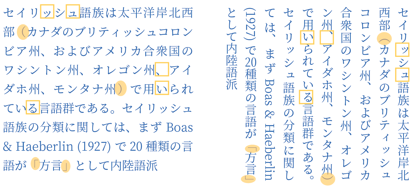
    • It supports vertical text layout and is compliant with the Unicode vertical text layout standard. The shape, orientation, and position of particular characters (e.g., brackets and kana letters) are changed when the writing direction of the text is vertical.


    The sheer size of this project also required regional expertise! Glyph design would not have been possible without leading East Asian type foundries Changzhou SinoType Technology, Iwata Corporation, and Sandoll Communications.

    Noto Serif CJK is open source under the SIL Open Font License, Version 1.1. We invite individual users to install and use these fonts in their favorite authoring apps; developers to bundle these fonts with your apps, and OEMs to embed them into their devices. The fonts are free for everyone to use!

    Noto Serif CJK font download: https://www.google.com/get/noto
    Noto Serif CJK on GitHub: https://github.com/googlei18n/noto-cjk
    Adobe's landing page for this release: http://adobe.ly/SourceHanSerif
    Source Han Serif on GitHub: https://github.com/adobe-fonts/source-han-serif/tree/release/

    By Xiangye Xiao and Jungshik Shin, Internationalization Engineering team

    An open source font system for everyone

    Thursday, October 6, 2016

    Originally posted on the Google Developers Blog

    A big challenge in sharing digital information around the world is “tofu”—the blank boxes that appear when a computer or website isn’t able to display text: ⯐. Tofu can create confusion, a breakdown in communication, and a poor user experience.

    Five years ago we set out to address this problem via the Noto—aka “No more tofu”—font project. Today, Google’s open source Noto font family provides a beautiful and consistent digital type for every symbol in the Unicode standard, covering more than 800 languages and 110,000 characters.

    A few samples of the 110,000+ characters covered by Noto fonts.
    The Noto project started as a necessity for Google’s Android and Chrome OS operating systems. When we began, we did not realize the enormity of the challenge. It required design and technical testing in hundreds of languages, and expertise from specialists in specific scripts. In Arabic, for example, each character has four glyphs (i.e., shapes a character can take) that change depending on the text that comes after it. In Indic languages, glyphs may be reordered or even split into two depending on the surrounding text.

    The key to achieving this milestone has been partnering with experts in the field of type and font design, including Monotype, Adobe, and an amazing network of volunteer reviewers. Beyond “no more tofu” in the common languages used every day, Noto will be used to preserve the history and culture of rare languages through digitization. As new characters are introduced into the Unicode standard, Google will add these into the Noto font family.

    Google has a deep commitment to openness and the accessibility and innovation that come with it. The full Noto font family, design source files, and the font building pipeline are available for free at the links below. In the spirit of sharing and communication across borders and cultures, please use and enjoy! 
    By Xiangye Xiao and Bob Jung, Internationalization

    Introducing OpenType Font Variations

    Wednesday, September 14, 2016

    Cześć and hello from the ATypI conference in Warsaw! Together with Microsoft, Apple and Adobe, we’re happy to announce the launch of variable fonts as part of OpenType 1.8, the newest version of the font standard. With variable fonts, your device can display text in myriads of weights, widths, or other stylistic variations from a single font file with less space and bandwidth.
     OpenType variable fonts support OpenType Layout variation.
    To prevent that the $ sign becomes a black blob,
    the stroke disappears at a certain weight.


    At Google, we started tinkering with variable fonts about two years ago. We were fascinated by the typographic opportunities, and we got really excited when we realized that variable fonts would also help to save space and bandwidth. We proposed reviving Apple’s TrueType GX variations in OpenType, and started experimenting with it in our tools. The folks at Microsoft then started a four-way collaboration between Microsoft, Apple, Adobe, and Google, together with experts from type foundries and tool makers. Microsoft did the spec work; Apple brought their existing technology and expertise; Adobe updated their CFF format into CFF2; and we brought the tools and testing we’d been developing.  After months of intense polishing, the specification is now finished.

    On the Google end, we did a lot of work to build, edit and display variable fonts:
    As always, all our font tools are free and open source for everyone to use and contribute.

    Now that the spec is public, we can finish the work by merging the changes upstream so that our code will soon flow into products. We’ll also update Noto to support variations (for many writing systems, the sources are already there — the rest will follow). Much more work lies ahead, for example, implementing variations in Google Fonts. Together with other browser makers, we’re already working on a proposal to extend CSS fonts with variations. Once everyone agrees on the format, we’ll support it in Google Chrome. And there are many other challenges ahead, like incorporating font variations into other Google products—so it will be a busy time for us!  We are incredibly excited that an amazing technology from 23 years ago is coming back to life again today. Huge thanks to our friends at Adobe, Apple, and Microsoft for a great collaboration!

    To learn more, read Introducing OpenType Variable Fonts, or talk to us at the FontTools group.

    By Behdad Esfahbod and Sascha Brawer, Fonts and Text Rendering, Google Internationalization

    Roboto: Google’s signature font is now open source

    Tuesday, May 26, 2015

    The Roboto family of fonts, and the toolchain used in creating it, are now an open source project. Roboto is Google’s signature font, created by Google designer Christian Robertson. It is the default font used in Android and Chrome OS, and is the recommended font for Google’s visual language, Material Design.

    The font files for the Roboto family of fonts were first released under the Apache license as part of Android 4.0 (Ice Cream Sandwich) in 2011. With this launch, we are making Roboto a true open source project, with a revamped font production toolchain that is completely based on open source software.

    Another key improvement in the Roboto font family has been the vast expansion of its character coverage to include all Latin, Cyrillic and Greek characters in Unicode 7.0, as well as the currency symbol for the Georgian lari, to be published in Unicode 8.0. For the expansion, the number of glyphs provided in the fonts more than tripled in number, going from around 13,000 (1071 per font) to more than 40,000 (3350 per font). An earlier version of the expanded font family is included in Android 5.0 (Lollipop) and later.

    This project involved close collaboration between various teams at Google: Material Design, Internationalization Engineering, Google Fonts and Android.

    The Roboto open source project lives at https://github.com/google/roboto. Bug reports and other contributions are welcome.

    By Roozbeh Pournader, Android Text team

    You've Got CFF!

    Wednesday, June 19, 2013

    Seven weeks ago today, Google along with Adobe and the FreeType project, released a new CFF rasterizer into FreeType for beta testing. Well, it’s been put through its paces and is ready for release. In the latest version of FreeType, build 2.5, the new Adobe CFF rasterizer will now be on by default. This means that products using FreeType, such as Chrome OS, Android, and Linux, will have better looking CFF fonts.  The new CFF rasterizer in FreeType has already been made available in the dev channel build of Chrome OS.
    FreeType Using the Old CFF Rasterizer with Light Auto Hint (most common setting)
    FreeType Using the Adobe CFF Rasterizer (now the default CFF rasterizer)
    The open source community has helped us find and fix several issues during this beta period and we are now ready for a stable release. The Adobe CFF rasterizer will continue to spread to new products. This work paves the way for FreeType-based platforms to provide users with richer and more beautiful reading experiences. This is only the start!

    By Stuart Gill, Font and Text Team, Internationalization Engineering

    Open Standard Color Font Fun for Everyone

    Wednesday, May 29, 2013

    People love using Emoji to communicate—it started in Japan and then spread through Asia and is becoming increasingly popular in the rest of the world. Instead of texting "How about going for a burger and beer at 7pm?", it’s much more fun to say,
    To make this possible everywhere, we are releasing an open standard for color fonts and have added support for it to one of the most popular font rendering engines in the world—FreeType.

    We want to make color Emoji available in an open and free way anywhere that you use text. Before the release of this new open standard, the use of color glyphs has been limited to systems doing special text processing and inserting images into the text or by using closed proprietary font formats. Both of those approaches have serious limitations. They make it difficult for developers to support color text in their applications and it is impossible for users to change the images used for the characters.

    We are releasing four pieces to help developers start adding support to their systems: 
    1. specification for enhancements to the OpenType standard
    2. source changes to the FreeType rendering engine and the Skia 2D graphics library
    3. a tool to embed color glyphs into fonts
    4. three sample color fonts

    These are all freely available to download and use from the Color Emoji Font Project site. Further, the changes to FreeType have also been integrated into the main code repository.
    While color emoji may be the initial motivation for adding color to fonts, it is not the only reason to do so. Color fonts allow for a huge amount of extra expressive power. How about a font made from color images of fruit or a font that looks like extruded plastic blocks? You don’t have to imagine them -- have a look at the text that starts this blog post, it was produced using the FruityGirl font. You can download this font as well as Funkster from our project site and a prototype emoji font built from the Phantom Open Emoji images. These fonts show just a hint of what is possible.

    This new format for storing color glyphs in fonts will allow for more expressive communication in everything you use. We hope that providing this open source release will truly bring a more colorful tomorrow!
    Note: What appears to be color fonts in this blog post have been simulated. There is not yet a way to show these in text form until this technology makes its way into the products that you use. The work we have released is the first step in this process. We are working to get all of the other pieces in place.
    By Behdad Esfahbod and Stuart Gill, Font and Text Team, Google Internationalization Engineering

    Got CFF?

    Wednesday, May 1, 2013


    A dramatically improved CFF rasterizer for FreeType

    In our commitment to the open source community, Google, in cooperation with Adobe and the FreeType project, released the Adobe CFF engine, an advanced CFF rasterizer, into open source for beta test. This paves the way for FreeType-based platforms to provide users with richer and more beautiful reading experiences. The FreeType open source software powers font display on more than a billion devices. It is used for rendering on a variety of platforms including Android, Chrome OS, Linux, iOS, and many versions of Unix.

    OpenType, an extension of TrueType, can describe glyph outlines in two ways  TrueType outline format and Compact Font Format (CFF). CFF is a descendant of the PostScript font format developed by Adobe. These formats use different approaches to specifying the glyphs (the images for each character) and the hints (the instructions on how to modify a glyph to look good at certain sizes). CFF fonts are capable of very high quality display but the technology places the burden for this display quality on the text rasterizer instead of on the font as is done in TrueType. The new Adobe CFF engine brings that high quality rasterizer support to FreeType.

    Because many display devices have finite resolution limits, displaying text requires balancing many things: making the text readable, ensuring that no characters are too light or too heavy, consistent height and width, all while respecting the original typeface design. The tradeoffs required to make the text look good are more difficult to balance as the size of the text decreases. For languages like Japanese, where there are often many strokes per character, it is even more difficult and great care must be taken to avoid the character turning into an unreadable blob.

    Text rasterization produced by the new Adobe CFF engine in FreeType is dramatically more faithful to the typeface design. The improvements include better stem widths and placement, fewer dropouts, dramatic reduction in the ‘blobbiness’ of Chinese, Japanese, and Korean, and more even visual weight. While all of this may sound somewhat technical, the advantages are not, and will benefit technical and non-technical users alike. These improvements lead to more beautiful looking text that is easier to read.

    FreeType Native CFF Rasterizer 

    FreeType Light Auto Hint Rasterizer

    FreeType using the New Adobe CFF Rasterizer


    In these examples you can clearly see an improvement in the overall “beauty” of the text when the new Adobe CFF rasterizer is used. The original FreeType CFF rasterizer is used in the first sample and it has very inconsistent blackness with a lot of blobbiness. The sample generated using the original FreeType rasterizer with auto hinting is in the middle and it is better but it lightens the original font too much and makes it faint, plus the individual glyphs have a lot of variation in height. Finally, the last sample generated using the new advanced rasterizer is on the bottom and it produces more even blackness of text, fewer blobs, more even and consistent character heights, and fewer dropouts.

    FreeType Native CFF Rasterizer

    FreeType Light Auto Hint Rasterizer

    FreeType using the New Adobe CFF Rasterizer

    The improvement for Latin text is just as striking. The example above shows the quality improvement - still with the original FreeType on top, FreeType with auto hinting in the middle, and the new advanced CFF rasterizer in FreeType on the bottom.

    The new Adobe CFF rasterizer is available to test as part of the FreeType release. Those who build applications and platforms using FreeType are encouraged during this beta period to test it out. The rest of you are unfortunately going to have to wait until after the beta test is done and the various platforms using FreeType have fully integrated the changes. We promise it will be worth the wait.

    By Stuart Gill and Brian Stell, Internationalization Engineering


    Build great font tools and services with sfntly

    Friday, November 18, 2011

    Earlier this month we released the sfntly font programming library as open source. Created by the Google Internationalization Engineering team, the sfntly Java and C++ library makes it easy for programmers to build high performance font manipulation applications and services. sfntly is really, really fast: Raph Levien, Google Web Fonts Engineer, says, "Using sfntly we can subset a large font in a millisecond. It’s faster than gzip'ing the result."

    Now, both Java and C++ programmers can use sfntly to quickly and easily develop code to read, edit, and subset OpenType and TrueType fonts. The Google Web Fonts team uses the Java version to dynamically subset fonts, and the Chrome/Chromium browser uses the C++ version to subset fonts for PDF printing.

    sfntly (\s-’font-lē\) was built from the ground up to provide high performance, an easy to use API, and both high-level and low-level access to font data. Font objects are both thread safe and high performance while still providing access for editing. After about a year of internal development sfntly is stable enough to move it into open source and share with others.

    Currently, sfntly has editing support for most core TrueType and OpenType tables, with support for more tables being added. Using sfntly’s basic sfnt table read and write capability, programmers can do basic manipulation of any of the many font formats that use the sfnt container, including TrueType, OpenType, AAT/GX, and Graphite. Tables that aren’t specifically supported can still be handled and round-tripped by the library without risk of corruption.

    sfntly is already capable of allowing many really exciting things to be done with fonts, but there is much more planned: expanding support for the rest of the OpenType spec and other sfnt-container font formats, other serialization forms, better higher level abstractions, and more.

    I encourage you to you join us on our journey as a user or a contributor.

    By Stuart Gill, sfntly Architect

    - Cross posted from the official Google Code blog
    .